Design system inventory template
Audit the foundations and components your product really uses, with variants, usage, status and an owner for each.
Use this templateFree, opens in your browser. No sign-up.
What's on the board
- Colors
- Primary blue #1D4ED8 · Neutrals: 10 grays · 3 reds in use: merge to 1
- Typography
- Inter 14 / 16 / 20 / 28 · Body line height 1.5 · 2 heading styles not documented
- Spacing & grid
- 4 px base, 8 steps · 12-column grid, 24 px gutter · Card padding varies: 12–24 px
- Icons
- Lucide, 24 px · 11 custom icons, 3 duplicates · Mixed 1.5 and 2 px strokes
Table columns: Component, Variants, Used on, Status, Owner.
Also on the board
- Screenshot every screen, then group the same UI together
- Fix first: merge the 3 modals, then the input a11y bug
How to use this template
- Click Use this template. It opens in the Kelvo app as a new board, saved in your browser.
- Double-click any box to change its text. Replace the examples with your own content.
- Sketch, then convert. Draw boxes and arrows with the pen, select the strokes and click Convert sketch: they become real boxes and links.
- Add notes fast. Press S for a sticky note in the middle of your view. A sticky is a box like any other: link it, recolour it, resize it.
- Link by dragging. Hover a box and drag one of its dots onto another box. The whole box is the target, and links stay attached when you move things.
Good for
- design system
- ui inventory
- components
- audit
- Synthesising research into personas and journeys
- Mapping a user flow before designing screens
- Planning and reporting a usability test
Related templates
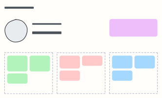 User persona
A one-page portrait of a key user: who they are, what they want, what gets in their way.
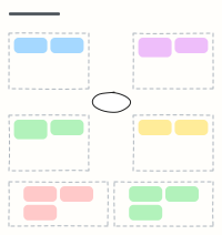 Empathy map
Capture what a user says, thinks, does and feels, plus their pains and gains, after interviews.
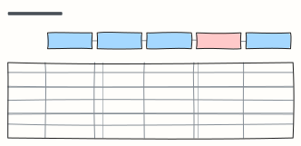 Customer journey map
Follow a customer through each stage: what they do, where, what they think and feel, and where to improve.
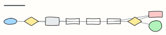 Checkout user flow
Every screen and decision from cart to order confirmation, including guest checkout and payment errors.
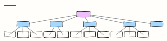 Website sitemap
The page hierarchy of a marketing site, from home to every section and sub-page.
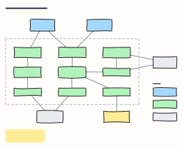 C4 component diagram
C4 level 3: the components inside one container, what each is responsible for, and how they reach databases and external systems.